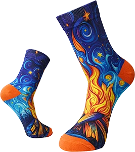
A great sock design can look disappointing if the file isn’t prepared properly. Blurry edges, stretched logos, and colors that don’t match the screen usually trace back to file setup, not the sock printer.
This checklist helps designers and print shop operators prepare artwork for digital printing socks on 360° rotary printers. Always follow the template sizes and settings from your sock printer supplier and RIP software. These tips are general best practices to use alongside them.
1. Start With the Right Template
Every sock style and size has its own printable area. Use the template provided for:
- The sock style (ankle, crew, knee-high)
- The size range
- The roller size used on your machine
Designing on the wrong canvas is one of the most common causes of misplaced logos and cut-off designs.
2. Use High-Resolution Images
- Work at the resolution your template and RIP recommend.
- Use original photos rather than screenshots or images downloaded from social media.
- Don’t upscale tiny images and expect sharp results.
- For logos, use vector files (such as AI, EPS, SVG, or PDF) when possible.
Low-resolution files become even more obvious once the sock stretches.
3. Design for Stretch
Socks are printed on a roller, then relax, then stretch again when worn. Keep in mind:
- Circles and text can distort around the calf. Test important shapes.
- The calf stretches more than the ankle on many socks.
- Fine lines can break up on open knits.
Always confirm with a physical sample. If you also print beanies, headbands or boxer briefs, see our notes on printing stretch fabrics beyond socks.
4. Make Repeats Truly Seamless
All-over patterns must join cleanly where the left edge of the artwork meets the right edge as it wraps around the tube.
- Build repeats with proper pattern tools, not by eye.
- Check the join zoomed in.
- Avoid placing faces or text right on the join line.
5. Plan Placement for Visibility
Think about how the sock is seen when worn:
- Outer side of the calf: the most visible spot for logos
- Front of the shin: visible when seated or in photos
- Cuff area: good for small text or a second logo
- Heel and toe: often hidden in shoes and may print differently due to knit structure
6. Manage Color Expectations
Screens show light; socks absorb ink. Colors can shift depending on fiber, pretreatment, and finishing.
- Design in the color mode your workflow recommends.
- Use the RIP profiles provided for each material.
- Print color swatches on real blanks to build a reference chart.
- Avoid relying on very subtle color differences.
7. Keep Text Simple
- Use bold, readable fonts.
- Keep text large enough to read once stretched.
- Avoid long sentences.
- Convert text to outlines if your workflow requires it, to avoid font issues.
8. Mind Contrast
High contrast reads better from a distance:
- Dark details on light backgrounds, or the reverse
- Avoid placing similar tones next to each other
- Test photos with busy backgrounds; simplify if needed
9. Prepare Personalized Files Efficiently
For personalized orders (names, numbers, pet photos):
- Create a master template with locked layout and placeholders.
- Use clear file names (order number, product, size).
- Double-check spelling before sending to print.
- Keep a proof approval record for each order.
10. Proof Before Production
- Send a digital mockup to the customer.
- Print a physical sample for new designs, materials, or large orders.
- Check the sample stretched on a foot or form, not only flat.
Workflow Notes for Multi-Product Shops
If your shop prints socks alongside wrist sweatbands, cooling arm sleeves, headwear, or yoga wear, keep separate templates for each product and roller size. Colorido machines like the CO80-210PRO, CO60-100PRO, CO80-600DK, and CO70-220PRO handle socks and other tubular items, and the CO220-450MAX handles yoga wear. Clear templates help each design go to the right machine and roller. For yoga wear specifically, see our design tips for seamless leggings and tops.
Quick Checklist
- [ ] Correct template for style, size, and roller
- [ ] High-resolution images or vector logos
- [ ] Seamless repeat checked at the join
- [ ] Key elements placed in visible zones
- [ ] Colors checked against real swatches
- [ ] Text bold, large, and spelled correctly
- [ ] Good contrast
- [ ] Digital proof approved
- [ ] Physical sample for new designs
FAQ
What file format is best for sock printing?
Use the formats your RIP software supports. Vector files are ideal for logos, and high-resolution raster files work for photos.
Why does my printed color differ from my screen?
Screens and fabric show color differently. Material, pretreatment, and profiles all affect results. Use real swatches as your reference.
How do I avoid a visible join in patterns?
Build true seamless repeats and check the join closely before printing.
Should I print a sample every time?
For new designs, materials, or large orders, yes. Repeat designs on familiar blanks may not need it.
Better Files, Better Socks
Great custom printed socks start with well-prepared files. Use this checklist on every new design, and you’ll reduce reprints and delight customers. See finished examples on our custom printed socks page.
Leave A Comment