"The sock doesn't look like the design." It is one of the most common complaints in custom printing, and one of the most avoidable. Color management is the set of practices that makes printed socks match the artwork as closely as possible and, just as importantly, match each other from batch to batch. It is not magic; it is a series of consistent habits.
Why colors change
Many factors affect how a design looks on a finished sock:
- Screen vs fabric. Monitors emit light; socks reflect it. Some bright screen colors cannot be reproduced on fabric.
- Ink and fiber. Disperse ink on polyester and reactive ink on cotton produce different color ranges.
- Fixation. Colors change during heating or steaming and, for cotton, washing.
- Stretch. The sock is printed stretched on a roller and viewed relaxed or on a foot.
- Lighting. The same sock looks different under daylight, shop lighting and warm home lighting.
The role of profiles
A color profile describes how your printer, ink and fabric combination reproduces color. The RIP uses it to convert design colors into the right ink amounts. A good profile is specific: polyester and cotton need different profiles, and even different blank suppliers can benefit from their own. Our article on RIP software and your socks printer explains where profiles live in the workflow.
Building a reliable process
1. Calibrate your monitor. Designers should work on a calibrated monitor so they see consistent colors.
2. Use the right profile for every job. Label profiles clearly by fabric and ink.
3. Print test charts on real blanks. Print, fix and finish them exactly as production socks.
4. Judge color after finishing. Never judge a polyester print before heat fixation or a cotton print before washing and drying.
5. Use consistent lighting. A simple daylight-balanced viewing area prevents arguments about color.
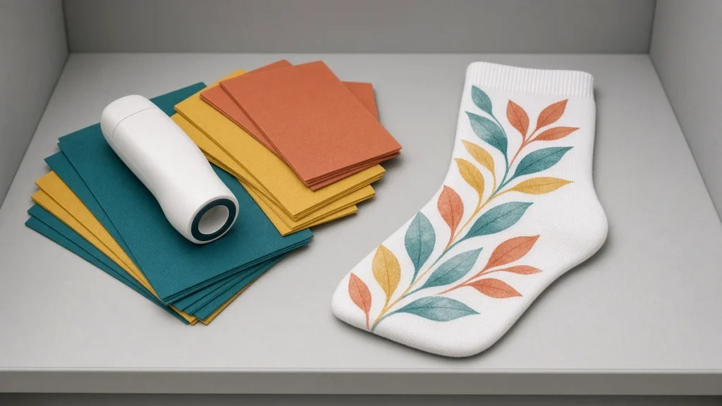
6. Build a physical color book. Print your most-used brand colors and reference swatches on each fabric. Designers and customers can choose from real printed results.
Spot colors and brand colors
Corporate clients often specify brand colors. Some colors may be outside the printable range on fabric. When that happens, print a small set of close alternatives and let the client choose. This avoids disappointment and builds trust. Ningbo Colorido states that continuous software optimization achieves 90%–95% color accuracy compared with original designs; however you measure it, show clients real printed swatches.
Consistency across batches
Matching the design once is only half the job. Reorders must match the first batch. To keep consistency:
- Keep fixation temperatures and times stable.
- Note ink batch numbers.
- Re-check profiles when changing blank suppliers.
- Keep nozzle health high; missing nozzles shift color. See our printhead care guide.
Designing with color in mind
Designers can help by:
- Avoiding very fine text in light colors on dark backgrounds.
- Using rich blacks carefully to prevent excessive ink.
- Testing gradients across the stretch area.
- Checking how colors look at the heel and toe, where stretch is greatest.
More design advice is in designing custom printed socks that sell.
Troubleshooting color problems
- Everything looks dull: check fixation and that the correct profile is selected.
- One color is wrong: run a nozzle check on that channel.
- Colors drift over a day: check room conditions and oven stability.
- Different operators get different results: standardize settings and loading.
Building a practical color routine
Color management does not need to be complicated, but it does need to be consistent. A simple routine for a socks printer looks like this:
- Fix your conditions. Use the same ink set, blanks and fixation settings when building or checking profiles.
- Print a color chart on each fiber you sell, and keep the finished chart as a physical reference.
- Share the chart with designers so they choose colors that you can reproduce on that fiber.
- Print a proof of each new design before production, especially for brand colors.
- Re-check after changes such as a new ink batch, blank supplier or fixation setting.
Brand colors
Corporate customers often ask for exact brand colors. Explain that colors on knitted fabric can look different from paper or screen, and offer a printed swatch strip for approval. Agreeing on a physical sample avoids disputes later. Our guide to corporate custom printed socks covers approval steps.
Lighting
Judge colors under consistent, neutral lighting. Comparing a sock under warm workshop lights with a design on a bright screen leads to confusion. Many shops set up a small viewing area for color checks.
Related reading
See RIP software and your socks printer for where profiles are applied, and getting vivid colors on digital print socks for fiber and fixation factors.
Conclusion
Color management turns printing from guesswork into a repeatable process. Use the correct profile, judge color after finishing, view under consistent light, and keep the machine healthy. If you want to see how printed colors look on different fabrics, explore our applications and socks printer pages, or contact us to request printed samples.
Leave A Comment